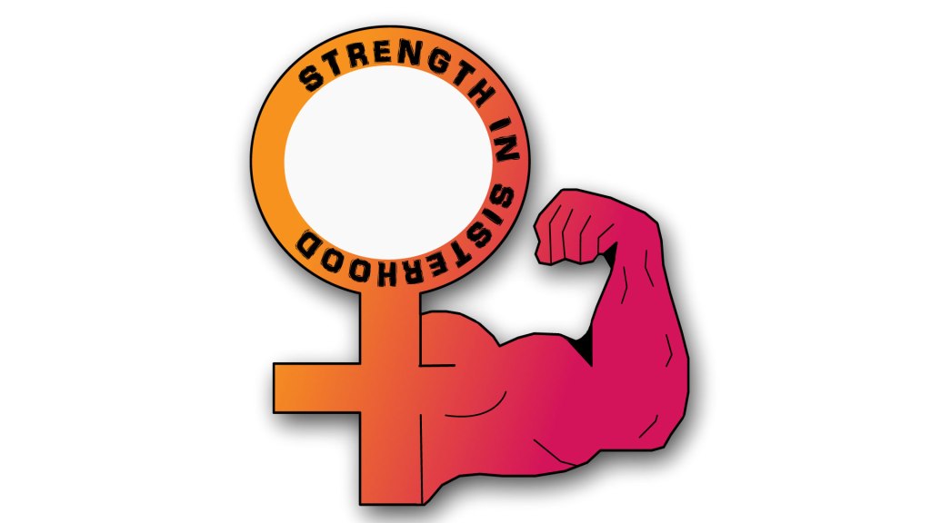
Final Draft Logo Project

I decided to create a logo that focused solely on the theme of my blog. My design process was to design an image that symbolized Women Empowerment without just solely using the words. My favorite company logos are ones that incorporate symbols and maximize on creativity, and that was my goal for my logo. My design was influenced by my blog post “Strength in Sisterhood”. Ever since I wrote that post, the title has stuck with me. Women empowerment is a popular topic nowadays, but I also feel like it can be subject to interpretation. I feel like “Strength in Sisterhood” really stands out and has a clear meaning. Women empowerment is not just about incorporating women into positions of power and entrusting them to make good decisions. Women empowerment is about uniting women in ways where we have been taught to compete with one another. Strength in Sisterhood symbolizes that we do not have to be at war with one another, instead we can support each other in every way that makes us great women: our ambition, success, beauty, confidence, and grace. I used the female symbol to represent women, and the muscular arm to show strength. I showed a couple friends my design and they immediately thought of women empowerment or that I was trying to show that women were strong. I thought it would be helpful to add the words “Strength in Sisterhood” so I am effectively communicating my idea so I did that by using the Type On A Path tool. I started by googling these two images and I drafted a way that I could combine them both. After I decided how I wanted the image to look, I looked up women empowerment symbols to see if this design already existed, and I was excited to see that it didn’t! That confirmed for me that my design was headed in the right direction. I used a lot of the techniques that were shown in the pencil and tracing tutorials. To create the female symbol I used the rectangle tool and drew two rectangles and layered them on top of one another and then used the ellipses tool and put the smaller circle inside the larger circle. I filled the inside color of the smaller circle with white and gave it no stroke so that it would blend in with the background . I traced this image ( https://www.123rf.com/photo_68319865_stock-vector-strong-power-muscle-arms-vector-icon-muscular-hand-symbol-for-fitness-club-emblem-illustration-of-st.html ) using the pen tool to create the arm. The challenge I faced was that after the arm was traced, it lacked definition. I hand drew with the pen tool lines to create fingers, and veins so that it looked more like the image that inspired my design. Lastly, I used the gradient tool and type on a path tool to add some additional uniqueness to the design. This design took a lot of maneuvering but I think it turned out great. I received really great feedback from my peers that was very encouraging–I did not expect for other to immediately understand my vision or think that the end result looked good because I created this logo from scratch. Some feedback that I received were to add a shadow around my image to give it some depth and look more realistic, which I did, and to make the text darker, which I did as well. I also adjusted the placement of the lines that create the fingers because I felt they were a little off in my first draft.
Here are the links to the images I used for inspiration: https://www.123rf.com/photo_68319865_stock-vector-strong-power-muscle-arms-vector-icon-muscular-hand-symbol-for-fitness-club-emblem-illustration-of-st.html
https://www.123rf.com/photo_83618312_stock-illustration-raster-illustration-pink-female-symbol-gender-sign-woman-.html

Leave a comment

Design a site like this with WordPress.com
Get started